Showing posts with label Classic Cars. Show all posts

Monday, February 9, 2015

Vintage Cars as a Part of Family Life-Race Car Drivers to Accountants

Author's Picture

We recently had an opportunity to review the family photos and I was surprised at the number of photos in the last 100 years my family has taken with vehicles as the subject or background. This got me thinking about the influence the cars in our families have on the future generations. 

Every day families interact with this single piece of equipment, and the car shares in memories like road-trip vacations and visits to the grandparents.  Cars undoubtedly leave a lasting imprint on the character of a family, be it a family like mine, or a famous racing family, it's almost easy to see the automotive influence passed down.

In my family archives, most notable was Grandpa's 1957 Chevy, black on silver 2 door Bel-Air (the all American car).  A beautiful quick car, yet practical with seating for a family of six with two bench seats. The car embodies an American dream of a successful middle-class family life.

Author's Picture

My aunt writes about the Bel Air, " I remember that old Bel Air, I spent many hours totally nauseated from car-sickness in the back of that thing! That's pretty much where I learned how to deal with car-sickness, and it's never happened to me since! But I also remember going on picnics, and we used to actually go on long Sunday drives out into the country, and passing tepees, which I thought was weird because they were on fire.  Of course they were lumber mill tepees, a thing that I believe exists only in the past now. I remember looking up at the moon from the cavernous back seat and feeling so special because the moon was following me. Hey, I was 4 years old! And I don't remember ever wearing a seat belt. The entire back seat was my domain!"

As you can see from the below pictures my family adopted automobiles fairly early in their development. By taking family photos with their cars it tells me that travel was important to my family and they connected to their cars as a useful and enjoyable tool that had earned a place in the family photos for services rendered. A tall order for any piece of equipment!  Ever seen a family gathered around a washing machine?  

Author's Picture


Practical, tall to traverse ruts, and large enough to accommodate a family, there was still a note of fun by choosing to go with a ragtop rather than a hardtop in the earliest family car photos. Oh, and don't forget the dog!

Author's Picture

As time passed, we succumbed to the need of a hardtop, and the family grew.  If all of the relatives in the below picture traveled to the photo shoot in the vehicle pictured, my family may have been the clown posse of a travelling carnival.

Author's Photo

Just how loved the family cars were shows when a forefather decided to catch a beautiful winter event in photograph.  Better get the cars in the scene! Still family oriented cars, and practical, yet slightly sporty.

Author's Photo

What strikes me about our family vehicles is that the vehicles owned generations later are similar in traits. My family car growing up was a Chevy Blazer with a balanced and blueprinted motor. In shape and use, it shared much with cars from my family's past. Practical and family friendly with a slightly fun side.

Author's Photo

My family drives a Nissan Xterra.  I would argue its almost the exact vehicle yet again in concept.

My family is not alone in this follow-the-leader game.  You often hear of sons following their fathers into racing, or the racing being a family affair.  I can imagine why this would happen.  If growing up you thought of cars as something sporty to be driven fast, why wouldn't you choose to use cars in the way you've been taught?  Racing is ripe with these stories, although unfortunately more than a few examples have ended in tragedy.

With no sense of organization other than the order in which I think of them, let's take a look at some of those famous family racing dynasties.

The famous F1 driver Graham Hill, pride of Great Britain and I believe the stereotype for more than one dashing cinema British villain is a prime example.  Imagine growing up watching your father become the world champion racing the hottest cars of the time!  What effect would that have on your life and how would you think of cars?

Graham Hill
HillGraham19690801Lotus-Nordkehre.jpg
"HillGraham19690801Lotus-Nordkehre" by Lothar Spurzem - Originally from de.wikipedia; description page is (was) herefirst upload in de wikipedia on 17:07, 19. Jun 2006 by Spurzem (2136 x 1433 (1.122.208 Byte) (* Bildbeschreibung: Graham Hill 1969 auf dem Nürburgring * Foto: Lothar Spurzem * Datum: 01.08.1969 eingangs Nordkehre Nürburgring Bild-CC-by-sa/2.0/de). Licensed under CC BY-SA 2.0 de via Wikimedia Commons.

Well, in this particular example, Damon Hill became the first F1 world champion to follow his father to victory.  Yet the family photos show that he was immersed in the culture of racing cars from the youngest age.  Note the below picture of baby Damon Hill surrounded by racing greats Stirling Moss, Graham Hill, Bruce McLaren, Wolfgang Von Trips and Jo Bonnier.

Damon Hill


It wasn't always fathers that led the children into racing.  Take for example the case of Pat Moss.  Her brother, Stirling Moss, was on his way towards the top of motor racing.  Pat had previously been involved in competitive horse events but surely her brother must have had some influence on her decision to go car racing.  She starts rally racing and becomes the first woman to outright win an international rally.  The family dinner conversations and weekend events must have had some influence on her desire and skills.

Pat and Stirling Moss


Earlier today I saw a fun youtube video of a short wheel base Ferrari 250GTO by Petrolicious which is embedded below.  But before you watch race car driver Derek Hill push the most expensive car in the world around corners with a screaming V12, remember that his father is the famous american race car driver, Phil Hill, who drove the same Ferrari to victory in the 1960s at races like Sebring.

Phil Hill in 1962
HillPhil1962

Derek Hill
  

And let's face it, American racing has numerous examples of sons who followed their father successfully into racing. Earnhardt stickers decorate the rear bumper of every would be NASCAR couch racer.  Or consider the Petty racing generations.  Richard Petty's number 43 Hemi is one of the best looking cars ever to drive in NASCAR, and one of the fastest; regulation has slowed cars since then.

"RichardPettyRoadrunner" by ckirkman at flickr - http://www.flickr.com/photos/ckirkman/114397439/. Licensed under CC BY 2.0 via Wikimedia Commons.

Petty's son Kyle has over 500 Cup starts to his record.  Sadly Kyle's son Adam, who also was following in the family footsteps, was lost in an accident.

Kyle Petty
Kyle Petty – "Kyle Petty PE2 Pontiac Phoenix 1997" by Darryl Moran - http://www.flickr.com/photos/dwmoran/3738172950/in/set-72157621828636960. Licensed under CC BY-SA 2.0 via Wikimedia Commons.

And like the Earnhardt and Petty family, sadly tragedy has also followed racing families through the generations.

Consider England's land speed record breaking father and son, Malcolm and Donald Campbell.  Both pursued land and water top speed records until both lost their life in the pursuit, separated by some odd 30 years or so.

Malcolm Campbell
"Blue Bird, Pendine, January 1927 (Our Generation, 1938)" by Andy Dingley (scanner) - Scan from Foreword by E. Royston Pike (1938) Our Generation, London: Waverley Book Company. Licensed under Public Domain via Wikimedia Commons.

Donald Campbell

Or how about Italy's father and son racers Antonio and Alberto Ascari, both Grand Prix champions? From wikipedia – "There were several similarities between the deaths of Alberto and his father. Alberto Ascari died on 26 May 1955, at the age of 36. Antonio Ascari was also 36 when he died, on 26 July 1925 (Alberto was only four days older). Both were killed four days after surviving serious accidents and on the 26th day of the month. Both had crashed fatally at the exit of fast left-hand corners and both left behind a wife and two children."

Fortunately not all family racing legacies are marred by tragedy. Consider the Unser family.  Beyond a father and son who both dominated racing at some point in their career, they've also shared an ability to move from Indy to NASCAR racing.

Al Unser Sr
AlUnser1984

Al Unser Jr

Penske-Mercedes PC23 - Flickr - andrewbasterfield

But we can't all be champion race car drivers and there are few fathers to lead sons in this direction.  The list of F1, Grand Prix and Indy champions is probably less than 200 men long for all time.  So what about the normal parents? Well, a fun search using photo sharing sites like Flickr is to look up "Family Car".  I'll post a few examples below of what can be found.  I believe these station wagon pictures are probably the same families that have minivans now.

The long and the short of it is, you're likely to be influenced by your parents vehicles.  Kids spend a lot of time in and around their parents cars and the character of those cars are likely to have an effect on the cars the kids purchase, and how they use them.

Maybe you'll be doing your family more of a favor than you understand by purchasing that more expensive 4x4 SUV if you use it for some notable adventures.  Or, maybe you should buy that Hemi powered Challenger and take your son to a track day or two in it.  Do you want them doomed to a life of boring vehicles because it's the model you set because you didn't want to spend a little extra for all-wheel-drive or some horsepower?  Can you say the word Prius and adventure in the same sentence?  I think not.

Untitled1


Family Vacation about 1969

Cruising California in 1966 in our cool salmon pink Chevrolet

- by Be For

Sunday, April 20, 2014

Classic cars - Technical development

In the beginning, cars were motorized horse carriages or, in the case of the three-wheeled Benz of 1889, relied heavily on cycle technology. Most cars were braked only by the rear wheel; steering, often by tiller, was slow and ponderous. a shoulder-high centre of gravity threatened to top the car over. All this was containable at the 4mp (6.4kph) first allowed in Britain for motor vehicles and not too scary at the 14mph (22.5kph) allowed by 1896, but as speeds rose, something had to be done. Makers who introduced each refinement created classics along the way.

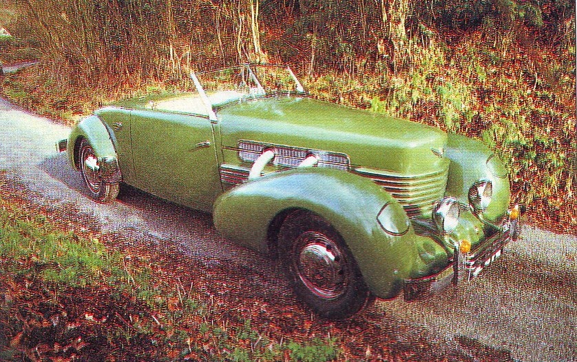
ABOVE : Cord's 810 used a super-charged V8 Lycoming engine with revolutionary front-wheel drive. 

TECHNOLOGY FILTERS DOWN
Excellence began with high-class cars such as the Rolls-Royce and Bentley. Steadily, the technology filtered down to such humble transport as the Austin Seven. By the start of the Second World War, bodies were generally made of steel, sat on a separate chassis, and there were brakes all round. Jaguar brought disc brakes to the world's notice at Le Mans in 1953; five years later they appeared on Jaguar's road cars and soon every maker used them.

REFINEMENT FOLLOWS
Four-wheel drive, with anti-lock brakes, was pioneered by Ferguson Formula. It first appeared in a passenger car on the Jensen FF of 1966, along with Dunlop Maxaret anti-lock brakes derived from aircraft technology. It was expensive and complex - only 320 were built.

ABOVE : The Lancia Aprillia was a ground-breaking saloon of the mid-1930's. 

Overhead camshafts allowed more direct operation of valves and a better combustion-chamber shape. They were used on specialist racing cars such as the Alfa Romeo and Bugatti from the 20's onwards and were introduced to the mainstream in the straight-six XK engine in the 120 of 1948. Soon, makers realised they could run double overhead camshafts and multi-valve layouts.

Self-leveling was a standard feature of the futuristic DS launched in 1955 by Citroën. Even the cheaper 2CV had a modicum of leveling, because front and rear suspension were inter-connected by springs. The British Motor Corporation (BMC) 1100 and 1800 of the 60's - and Minis of the period - are inter-connected hydraulically. Self-leveling was used at the tail-end of the Range Rover from its launch in 1970.

ABOVE : The revolutionary Mini, a masterpiece of packaging. 

Front-wheel drive used by BSA, Cord and Citroën since the 30's, did not hit the mainstream until the Mini appeared in 1959. While scorned by purists, this layout makes for safe, predictable handling and better packaging - more interior room for a given size - than rear-driven counterparts.

All the while, chassis improvements and tyre technology shadowed each other: Citroën's Traction-avant was the first car to use radial tyres, the narrow and distinctively treaded Michelin X.

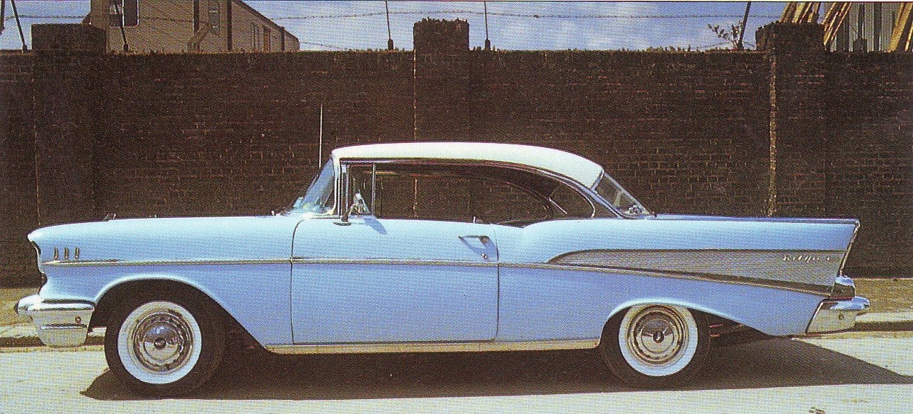
ABOVE : A 1956 Chevy: crude - but comfortable and well-equipped. 

AMERICA THINKS BIG
In America, spacious cars with powerful, six- and eight-cylinder engines were common, even before the war. Makers loaded cars with every device to take the work out of driving: automatic transmission, power steering, power brakes, air conditioning, self-dipping headlamps. Engines, generally under-stressed by large capacity, show-cased maintenance-free features such as hydraulic tappets (initially used for quietness).

- Extracted from 'The World Encyclopedia of Cars' by Martin Buckley and Chris Rees

.

- by Be For

Saturday, March 29, 2014

10 Ugly Classic Cars, and Why We Think They Look Awesome Regardless

Photo - Flickr Creative Commons License, Photographer:
Scott Crawford

Some classic cars were designed for a trendsetter that lived in a place where the locals are beautiful, but others were designed by an individual named Bruno who lived in a place where the locals have taken their share of beatings from the ugly stick.  Yet somehow Bruno has managed to design classic cars that still manage to look “good” despite the brutality of their design.  You’d never say Bruno’s cars are gorgeous; a classic red Ferrari his cars are not.  But they capture your eye and heart just the same.

There’s a place in the world for Bruno’s cars.  If you handed the keys to a red Ferrari to the local iron yard riveter he would likely steal it and sell it for beer money and hunting supplies.  He wouldn’t keep the red Ferrari because he’d be ashamed to be seen in such a girly-man car. He doesn't like Italian designer jeans, cologne, etc. and he thinks you have to in order to drive a Ferrari.
Photo by Author, no rights reserved

But if you hand the riveter the keys to Bruno’s creation he’ll wear t-shirts emblazoned with the car’s manufacturer logo every weekend for the rest of his life.  He may still steal the car, but he’ll park it on his lawn when he gets home and then sit in a lawn chair drinking whiskey while staring at it because he’s suffering from an overwhelming man crush.  His girlfriend will leave him for Earl in the trailer down the “court” because all he’ll ever talk about is the car and soon his only friends will be other gentleman of similar distinction (typically found at car shows highlighting the car’s manufacturer).
What are these cars?  I’ve made a top 10 list based on my experience and taste.  The first five on the list don’t have the engine displacement and ferocity to appeal to a steel riveter.  These are cars owned by guys that just can’t see themselves in a “pretty” car, but their testosterone production isn’t quite what it may have been.  They’ll take ugly and slower, a surprising pick for sure, but a comfortable place for them.  Sound harsh?  Don’t worry, the author may self-identify with this group.  Here’s a photo of his car –
Photo by Author, no rights reserved

Don’t agree with my conclusions?  Well good, put the beer can down and write a snarky remark into the comments section of this blog letting me know why you and your car show buddies think that the car I named isn’t ugly.

#10

Photo - Flickr Creative Commons License, Photographer:
Jim Culp

The (original) Fiat Abarth – Seriously, you have to prop the motor cover open just to fit the parts in?  And did Fiat pay someone to design a body that looks like two squares welded together?  And don’t forget, if you truly want to cool that hot motor, you’ll have to plumb cooling into the front end giving it the look of a flat faced boxer with a fat lip.
Photo - Wiki Creative Commons License, Photographer:
Alf Van Been
#9
Photo - Flickr Creative Commons License, Photographer:
Chris Waits
The Datsun 510 – They say the best looking cars are designed with the shape of a woman in mind.  The 510 was designed with the body of a short stubby man in mind.  But he was a strong stubby man.  And the 510 proved that although it was the short kid on the block it still packed a wallup.
Photo - Flickr Creative Commons License, Photographer:
Jim Culp
#8
Photo - Flickr Creative Commons License, Photographer:
p18001968
The Volvo P1800 – This is the car shape you get when designed by people that have to survive a harsh winter climate but still allow themselves the fancy of believing in elves, gnomes and fairies.  Up front the car has a strong motor fronted with a somewhat awkward grille and surrounded by good looking fenders, but the body tapers back to strange frivolous fins.
Photo - Flickr Creative Commons License, Photographer:
Tim Wang
#7
Photo - Flickr Creative Commons License, Photographer:
Jim Culp
The Saab 96 – this car was produced in a town called Trollhattan.  No surprise then that a troll would feel perfectly at home behind the wheel.  No other classic car could ferry him between the snowy bridges he frequents with the speed and anger he requires.
Photo - Flickr Creative Commons License, Photographer:
Brian Snelson
#6
Photo - Flickr Creative Commons License, Photographer:
Pyntofmyld
The Jensen CV – In black they look best (which in itself says something about a car) but their lines don’t quite flow, they have odd headlights, and the front end would probably best be described as a snout.  Yet somehow they still look good.  I’ve never been to Ireland, but I imagine that for a manager working the Irish shipyards if the laborers spotted you driving the CV you wouldn’t have to fear any ridicule; you have to maintain whatever fleeting perception of authority you have when pressing the union workforce for production.
Photo - Flickr Creative Commons License, Photographer:
Nigel Honey
#5
Photo -Wikimedia
Allard Cars – One can only hope that Mr. Allard made a conscious decision to simply wrap his American motored V8 rockets in sheet metal as a necessity, rather than style the body.  Based on looks it appears the Allard is the epitome of function before form.  For example, yes it has a radiator grille.  The purpose of the Allard grille is to provide airflow to the radiator while blocking the birds from going through the radiator, The Allard grille is not meant to look good.  Almost every visible part on the Allard can be summarized in similar fashion.
Photo - Flickr Creative Commons License, Photographer:
HutDog83
#4
Photo - Flickr Creative Commons License, Photographer:
Ryan McAbee
The Big Block Cobras – As the power and ferocity grew inside the quant little British designed body strange bulges and protrusions also grew around the exterior of the car.  Like a steroid induced body builder, the big Cobras don’t look natural in their own skin. You almost expect them to tear their hood off at any minute like a flashback to 1980’s steroid lovin’ Hulk Hogan ripping his shirts in half before wrestling matches.
Photo - Flickr Creative Commons License, Photographer:
Serge
#3
Photo - Flickr Creative Commons License, Photographer:
Jim Culp
The AMC Javelin in Trans Am guise – an underdog always looks good whipping on the pretty boys.  And in 1970 the Javelin did just that, giving the Mustangs and Camaros a one-two punch on the Trans Am circuit.  But the Javelin was not pretty.  In fact, it was really ugly.  Why?  Likely it was heralding in the decade.  It seems most designers agreed “It’s 1970 and a new decade, let’s try ugly from here on out”.
Photo - Flickr Creative Commons License, Photographer:
Alden Jewell
#2
Photo - Flickr Creative Commons License, Photographer:
Xabier Martinez
The Lamborghini Countach – Even its name in Italian is vulgar (google it if you don’t believe me).  But it was awesome.  Ugly in a way only Italy could do – ugly beautiful.  It was utter rebellion.  Compare the sloping curvaceous lines of the 1960’s Ferraris with this upstart from just a few years later.  Everything was different.  It was big.  It was angular. It was impractical.  It was mean.  But yet, somehow still Italian.  And when you think Italian sports car, you just can’t think of barrel chested men driving them.  Had the car been made in America I’m certain it would have made number one on this list.  It would have made sense.  It’s a brutal, ugly, hard to drive car with impressive power.   But Italy is the land of playboys and somehow you can’t escape the sense that the only person driving the Countach is a man that goes to the tanning bed, wears a v-neck shirt with a sport jacket, and protects his eyes with oversized designer sunglasses.  Pity the Countach, it can’t escape its origins.
Photo - Flickr Creative Commons License, Photographer:
Brian Snelson


#1
Photo - Flickr Creative Commons License, Photographer:
Rex Gray
And the winner is a twofer – The Charger and Barracuda of the 60s.  Dyno tests now tell us that Dodge was lying about the horsepower of these Hemi monstrosities by underrating them severely, when the competition was doing the opposite to compete.  These cars are brutally powerful and they look like a drug fueled biker club member would be comfortable driving them.  The large body and wide grille can be compared with a fist coming at you fast with a large powerful forearm behind it. There’s a reason the bad guy drove a black charger in Bullet.  Have you ever seen a white Charger?  The Charger and Barracuda epitomize tough.  Don’t believe me?  I dare you to kick the next guy you see wearing a Mopar shirt in the shins.  
Photo - Flickr Creative Commons License, Photographer:
Scott Crawford

Photo - Flickr Creative Commons License, Photographer:
Ashley Coates

- by Be For

Saturday, November 23, 2013

A Brief History of Vintage Neon Signs with a focus on the Road Signs of Portland Oregon


I commute daily almost 3 hours.  A large portion of that commute is along Route 99 West and often as I've sat stuck behind a row of high performance BMWs driving two miles-an-hour because it's lightly misting I've had a lot of time to enjoy the great looking vintage road signs along Route 99W.  In addition, when my meanderings have found me on the other side of town I've enjoyed what I've seen on Route 99 East (for instance a B-17 mounted over a vintage filling station).  The Route 99 routes run North to South through Oregon and it's apparent they were the motorway before I-5.


I decided to travel the Routes (East and West) and take pictures of the signs to share with others.  I self published a book filled with many of those pictures that you can preview the whole book and purchase here:

http://blur.by/1b50Ses


If you like the book but think, "Holy crap that's expensive", I can comiserate.  I only make a $1.50 per book.  Apparently, print-on-demand costs significantly more than the economies of scale scored by Barnes and Nobles mass publications of coffee table books.  If you do buy my book feel happy that you're supporting the man with the vision and the passion, not a corporation... except my printer who might be making $20 or $30 per book but I don't want to think about that.

But that book only piqued my curiosity.  Who made these signs?  How are they made?  How old are they?  Some of these signs are obviously pieces of art but how hard are they to make?  Why aren't signs made like this anymore?


I decided to do a little research and it was fascinating.  I'm going to share it with you but I must caveat: It's utterly pointless for me to re-write what the experts wrote and I'm not in grade school or selling this blog so know that some of the below is not my writing and enjoy that I put it together in one place for you but know that much of it is blatant plagiarism.  It's 10 AM on a beautiful Saturday and I don't feel like chasing references all day, I want to go work on my 1957 MGA (www.budgetmga.blogspot.com).


So how did neon signs come about?  Well, the concept of charging gases in a vacuum tube to glow had been around a long time (since the 1600s).  But for the 1910 Paris Motor Show a guy named George Claude demonstrated a tube filled with Neon blazing brightly.  He was owner of a liquid air company, and Neon was one of the by-products his air company produced (along with others such as oxygen, acetlyln, helium, etc. for industrial applications (I'm guessing on what else he produced)).  Somehow he got the idea to try it in the vacuum tubes and figured out it worked wonderfully well!


Here's the signs from the 1910 show -


Here's his patent -


Interesting enough, I found court cases in the 1930s where he was suing everyone that joined the neon business.  Then in the 40's, when the Germans ran over France he became a Nazi sympathizer.  After the war he was tried and imprisoned.  Personal opinion here, but I get the indications from what I see that he was a ruthless business man without much personal integrity.


After the Paris show, according to Wikipedia, an Italian Vermouth company put up a neon sign.  I can't find any pictures of this online but neon was introduced to the US in 1923 when a Los Angeles Packard dealership bought two of the signs for $1250 a piece.  Consider at that time, a Model T was selling for circa $600 so these signs cost the equivalent of four cheap cars.

Packard sign -

Between 1910 and 1930 a number of innovations were made to increase the quality of the lighting including ways to purify the chamber of the glass and the coatings used inside the glass.

From Wiki -
"Over the next several years, patents were granted to Claude for two innovations still used today: a "bombardment" technique to remove impurities from the working gas of a sealed sign, and a design for the internal electrodes of the sign that prevented their degradation by sputtering."

"The next major technological innovation in neon lighting and signs was the development of fluorescent tube coatings. Jacques Risler received a French patent in 1926 for these. Neon signs that use an argon/mercury gas mixture emit a good deal of ultraviolet light. When this light is absorbed by a fluorescent coating, preferably inside the tube, the coating (called a "phosphor") glows with its own color."


The actual manufacture of neon signs was an artisan's work.  Here's a description of that process that's extremely abbreviated (also from wiki) -


"Neon tube signs are produced by the craft of bending glass tubing into shapes. A worker skilled in this craft is known as a glass bender, neon bender or tube bender."


"A section of the glass is heated until it is malleable; then it is bent into shape and aligned to a pattern containing the graphics or lettering that the final product will ultimately conform to. This is where the real art of neon comes in that takes some artisans from a year up to several years of practice to master. A tube bender corks off the hollow tube before heating and holds a latex rubber blow hose at the other end, through which he gently presses a small amount of air to keep the tube diameter constant as it is bending. The trick of bending is to bend one small section or bend at a time, heating one part of the tubing so that it is soft, without heating some other part of the tube as well, which would make the bend uncontrollable."

"A bend, once the glass is heated, must be brought to the pattern and fitted rapidly before the glass hardens again because it is difficult to reheat once completely cooled without risking breakage."

"It is frequently necessary to skip one or more bends and come back to it later, by measuring carefully along the length of the tube. One tube letter may contain 7-10 small bends, and mistakes are not easily corrected without going back and starting all over again. If more tubing is required, another piece is welded onto it, or the parts can be all welded onto each other at the final step."


At this point the tubes are then evacuated of all air and charged (per Mr. Claude's cleansing invention) to a massive voltage in order to get the impurities out.  They are then sealed and through a port neon is placed in the chamber.  The mechanism at the end of the tube also provides the charging port from which the electrical current is supplied to the tube.  The control of those currents can range from simple on/off to quite complicated if the lighting is designed to change.


Period articles of the time dubbed neon "liquid fire".

Because of the artistry and skill required to be a neon sign maker many of the early shops were mom and pop style.

Here's a photo of one shop in Michigan in the late 1930's -


After the Packard signs, neon signs exploded through the US.  One of the best descriptions I can find of why comes from the definition of "googie architecture" in Wiki -

"Alan Hess, one of the most knowledgeable writers on the subject, writes in Googie: Ultra Modern Road Side Architecture that mobility in Los Angeles during the 1930s was characterized by the initial influx of the automobile and the service industry that evolved to cater to it. With car ownership increasing, cities no longer had to be centered on a central downtown but could spread out to the suburbs, where business hubs could be interspersed with residential areas. The suburbs offered less congestion by offering the same businesses, but accessible by car. Instead of one main store downtown, businesses now had multiple stores in suburban areas. This new trend required owners and architects to develop a visual imagery so customers would recognize it from the road. This modern consumer architecture was based on communication"


Here's the history of one of Portland's early neon sign makers (taken from their website) -
"In 1911, a 28-year-old newspaper editor from Louisville, Kentucky was looking for a change. Arch Gibson Ramsay - known professionally as A.G. Ramsay - headed west to Portland, Oregon, married his sweetheart Zelma, and established Ramsay Signs as a handcrafting sign company in a small building in downtown Portland, Oregon."

"Though little is known of the earliest years of Ramsay Signs, business flourished throughout the 1910s and 1920s - the company had signs everywhere from Seattle, Washington to Redding, California. In the 1920s, the company expanded and opened Brilliant Neon Company, a subsidiary that focused on electrical signs rather than the gold leaf lettering Ramsay Signs installed for banks and other businesses downtown. Employees at the Brilliant Neon Company's shop, located in Portland's Hollywood District, were active in the community and used their expansive social networks made through various club memberships to sell signs in the neighborhood."


"In 1933, the Brilliant Neon Company was renamed Ramsay Signs, and the Brilliant Tube Company located in Portland, OR was acquired. This acquisition had been a long-time desire of A.G. Ramsay , when the Depression caused the Brilliant Tube Companies purchase price to plummet from $5000 in 1929 to a mere $750 in 1933, it was a deal A.G. Ramsay could not pass up. Ramsay Signs continued to defy the conditions of the Depression through the mid-1930s, noting in 1934 that they believed the "attitude of the buying public was turning around."

"When the war was in full-swing in 1942, Ramsay Signs faced its toughest times yet - far worse than at any time during the Depression. As men were shipped off to war they were faced with a labor shortage and the price of parts reached astronomical levels. Blackouts and dim-outs were becoming increasingly common in Portland and across the country; manufacturing - let alone selling - signs became a daunting task."

"When the company realized it couldn't survive on sign sales alone, the shop was converted into a plant for building and preparing war materials. While it is unclear exactly what those war materials were, from conversations with retired employees of the company it's believed those materials may have been cold cathode lighting and gas tanks for the military. This manufacturing was short-lived, as there was not much profit in supplying parts for the military. Through it all, the company survived, though it took several years before the company once again reached its levels of success prior to WWII."

Here's a photo of one Portland Intersection in the late 1930's -


As you can see, Portland's neon sign business was healthy in the late 1930's.

When I stopped into Lew's to take the picture of the sign, the manager came out and explained this sign was from the late 1920's when it was over Lew's cart which was located in a grove of farm trees.  Lew was successful enough to later build a restaurant.


One interesting concept I stumbled upon was of a company named Richfield.  Their plan was to build town's that incorporated everything a traveller would need around large Richfield signs.  These Richfield signs were meant to be both a beacon to motor and plane travellers.  At the base they would find fuel, airports, hotels, restaurants and etc.


Here's what one website had to say about Richfield -
" Almost overnight it seemed like everybody had a car and they were most anxious to use it, with flivvers flivvering hither and yon from Yuma to Yreka. These would-be Christopher Columbuses had money to spend, but not always so many places to spend it. Recognizing a need and thusly a way to make lots of money, a group of high-powered Los Angeles executives got together and in July 1928 they formed a corporation known as Highway Communities, Inc. Working in conjunction with the powerful Richfield Oil Company, the newly formed venture laid out a bold and exciting plan to create a chain of hotels, service stations and restaurants that would stretch all the way from the Mexican to the Canadian borders. All facilities would be strategically placed so as to reap the maximum benefit not only from automobile traffic, but from air travelers as well, with each location near an airfield."


The most famous Richfield sign was placed atop LA's city hall -

A 1928 article states that a 60' Richfield sign was placed on the hill above Portland but this late 1930's picture of the area the sign was to be shows the sign was already removed by that time.  No internet picture of this Portland Richfield sign exists so if you have one, post it please!

UPDATE - A reader of the blog emailed me a picture of the sign!  Here it is, possibly for the first time on the web, the Richfield Portland sign. Gray (who sent it in) said the letters were orange outlined in Orange neon. -


This 1928 sign must have been part of this effort, maybe even a prototype (also stolen from the above referenced website) - "The bold program got off to a roaring start on December 17, 1928, the 25th anniversary of the Wright Bros. history-making flight at Kitty Hawk, when the first six giant beacons went “live” with a gala ceremony held at Palm City, California, the southernmost site of a Richfield Beacon." 


We do have a town north of Portland named Richfield.  I can't help but wonder if it started as one of these Richfield developments (I would bet on it).

Richfield was operating in downtown Portland at the time, as you can see in the below photos (look hard, you'll see a Richfield in both.


After the war, through the "Googie" period, neon signs continued to be popular.

From Wiki -
"Googie architecture is a form of modern architecture, a subdivision of futurist architecture influenced by car culture, jets, the Space Age, and the Atomic Age."


"Features of Googie include upswept roofs, curvaceous, geometric shapes, and bold use of glass, steel and neon. Googie was also characterized by Space Age designs symbolic of motion, such as boomerangs, flying saucers, atoms and parabolas, and free-form designs such as "soft" parallelograms and an artist's palette motif. These stylistic conventions represented American society's fascination with Space Age themes and marketing emphasis on futuristic designs."

Bob's Big Boy is probably the ultimatum of "googie"-


The below photos from around Portland clearly reflect Googie design.


Here's what one local Portland hotel owner has to say about his sign (stolen from a website) -
"It's one of the favorite lights in my life," Bhanu Patel says of the neon sign towering outside the motel he purchased in 1997. "It's my heart."

The Palms sign stands a staggering 50 feet tall on North Interstate Avenue, an electric totem forcing all who pass it to take notice. Or even to stop and stare in awe. Folks from around the world swing by the Palms to have their picture taken in front of the set of glowing trees and the little monkey that reaches for a coconut, Patel says. He believes the sign was built in 1952. The Palms has also been the set for a number of indie films. Someday soon, the owner hopes to augment his sign. "My one dream is to have a couple more monkeys to catch the coconut," he says. 


Here's a circa 1960 Portland photo showing some of the downtown signage -


This is an excellent video of moving neon signs around Portland -


Even my 1972 Ford F-250 has an atomic symbol on the AC unit as a decal.

Modernism all but killed Googie and neon signage as it was dabbed too flashy.  Only recently has a real effort been made to save existing examples from the period of history that reflected America's transformation to a traveling and commuting society.  Some argue that effort started when LA attempted to put one of the very first McDonald's on the historic registry (the owner resisted but did agree to preserve the spot.


Modern signs now are a much cheaper and easier to produce plastic with translucent paints, lighted with standard lights under.


The degree of artistry needed to produce modern signs has been reduced almost to zero.  Just look at a Home Depot sign.


Let's do everything we can to preserve the signs that still exist from that fascinating period in American history.  The signs represent much more than an advertising technique, they represent what was happening in American culture at that time and are part of our national heritage.


Remember to check out the author's book documenting some Portland signs here -


- by Be For